One of the more important indicators of Rhode Island's economic performance is income tax withholding. Part of the reason for its importance is that it is not a survey-based indicator, so we don't have to worry about the possibility of survey error and subsequent revision. Furthermore, income tax withholding is real-time data. But it is not what economists refer to as a "leading economic indicator," which is the best type of indicator to use when attempting to predict the future. To the contrary, income tax withholding is a "lagging indicator" which reflects economic activity in past months.
In using income tax withholding as the basis for attempting to understanding Rhode Island's current economic performance, three things must be taken into account. First, income tax withholding is a nominal value, meaning that it does not take inflation into account. Therefore, inflation can distort this indicator, making its performance appear to be better than it really is. Second, there are seasonal variations in the amount of withholding collected throughout the year. To account for this, it is necessary to perform seasonal adjustment. After both of these adjustments have been made, it is possible to meaningfully compare any particular month to any other month. The result, after both of these corrections have been made, is called seasonally adjusted real income tax withholding. To simplify this and what follows, I will simply refer to it as real withholding. Finally, it is critical to remember that, as stated above, withholding is a lagging economic indicator.
First, let's take a look at income tax withholding using seasonal adjustment, but not adjusting for inflation. The chart below shows this (click to enlarge). Its performance of late looks very impressive. Someone using this chart as the basis for determining how well Rhode Island's economy is performing would almost certainly give a very positive vote -- the line of late is clearly sloping upward with a respectable slope.
Now for a more detailed look -- place the above chart in the context of the longer-term trend in withholding, as shown in the next chart (click to enlarge):
While the recent trend still seems promising, in a longer-term context it is apparent that since 2008, income tax withholding in Rhode Island has remained below its longer-term trend. But can't that just be evidence that this recovery has been relatively slow compared to past recoveries? The answer is yes it can. But since neither of the above charts takes inflation into account, we need to view real income tax withholding before making any final determination on current economic performance based on withholding.
The final chart takes inflation into account, showing real income tax withholding (click to enlarge). I have made the base period the purchasing power of September of 2011 (the most recently available data). Notice how real withholding has failed to break above its recent highs of around $75 million, and that it has remained range bound between $70 and $75 million throughout this entire recovery. I labelled these as "support" and "resistance," respectively, terminology from the technical analysis of markets. So, it is not in any way a stretch to state that during this entire recovery, Rhode Island's real income tax revenue has displayed a flat (horizontal) trend. So, while current dollar income tax withholding has been rising, as the above two charts show, its relatively static real value reflects the fact that current dollar growth has only matched, and failed to exceed, the rate of inflation.
However, that's not necessarily bad news. State budgets are run based on nominal values, and nominal withholding growth appears to be strong up to this point. And therein lies the true caveat: what happens from this time forward?
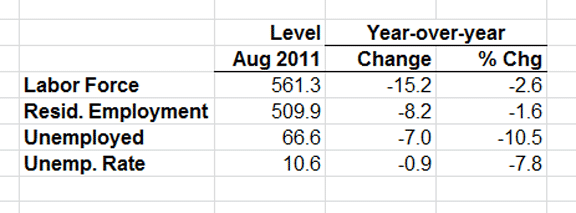
The answer to this question cannot be adequately determined based solely on the past behavior of any single indicator like income tax withholding, whether nominal or real values are considered. As I have indicated numerous times on this Blog, it is necessary to "hedge" one's bets by using a set of indicators to arrive at a far more educated answer to this question. And that is precisely why I formulated and publish my Current Conditions Index each month (http://www.llardaro.com/current.htm ).
The CCI value for August indicated a contraction value (of 42). If we were to observe a string of several consecutive contraction values, it would then be appropriate to conclude that Rhode Island would indeed have begun a double-dip recession. But we are not there yet. And at this point, I am not willing to make that call.
A blog devoted to providing my perspectives on the Rhode Island economy that utilizes discussion, tables, graphs, and hyperlinks to illustrate key points and where I come a lot closer to saying what I really think than what I say to the general media. A DISCLAIMER: Everything in and on this Blog is solely attributable to me and bears no connection whatever to either the University of Rhode Island overall or the URI economics department.
Monday, October 24, 2011
Tuesday, October 11, 2011
Current Conditions Index: August 2011
This is an abbreviated version of the August Current Conditions Index report. For the tables, historical reports, and more information, please visit my web site: http://www.llardaro.com . I made my monthly appearance on Channel 10 this morning. Here is a link to that interview. And, as always, the CCI received excellent coverage in both the Providence Business News and GoLocalProv.com , while as of the time I am writing this post, the ProJo has yet to even mention it.
So much for a potentially strong start to the third quarter!
While the Current Conditions Index originally registered a jump to 67 in July
from 58 in June, updated data caused July’s value to be revised down to 58
based on New Claims, which moved from a slight decrease (improvement) to a small
increase. What could possibly be worse? August’s CCI value fell all the way to
42, a contraction range reading, as only five of the twelve CCI indicators
improved this month. Note that this contraction reading occurred only three
months after the neutral reading (of 50) for May. Taken together, these recent
CCI values reaffirm what I have been saying for a while now: Rhode Island’s
economy has definitely slowed over the past several months. In fact, the set of
2011 CCI values up to this point are
trending lower, as we are have witnessed lower highs and lower lows. However, this does
not indicate that Rhode Island has entered a recession. It is
never advisable to make too much of a single month’s data. Were Rhode Island in
recession, we would have observed six or more consecutive contraction readings.
So, while I continue to believe that there is a 50 percent chance of a
recession for Rhode Island this fiscal year, I do not believe
we are in a recession at the present time. But the bizarre labor market data
for August certainly make this pronouncement considerably more difficult.
Sunday, October 2, 2011
It's Not Supposed to Be Like This!
Pardon the fact that I have not posted anything for a while, I switched from Cox Cable to FiOS (ready my post about issues I was having) and had to make all the required changes associated with this. Please note that my web site has now been moved to http://www.llardaro.com .
Recent gains in payroll employment here, which have at times appeared to defy gravity, seem to contradict any hint of weakness, reinforcing the declining unemployment reflects economic strength view. You might think that these large monthly employment gains have been a potential source of confusion to me, as my Current Conditions Index has continued to show a slowing pace of economic activity in Rhode Island. But as of 2011, I have been following Rhode Island's economy for twenty years. Suffice it to say that along the way I have observed and come to know all too many patterns and data combinations that reflect the idiosyncrasies of Rhode Island's economy.
But one doesn't need all this experience to know that it is always preferable to focus on a set of indicators, not any one single variable, to gain an accurate picture of Rhode Island's economic performance. That, of course, was the basis for my creating the Current Conditions Index. And even for a single indicator like payroll employment, there are often several related measures worthy of observation.
As I have discussed in prior posts, there are two measures of overall employment for Rhode Island. The first, which I have been alluding to above, is payroll employment, the number of jobs in Rhode Island. The second is resident employment, the number of Rhode Islander residents who are working, irrespective of whether this occurs in or outside of Rhode Island. One major difference between these is the inclusion of self-employed persons in resident employment. And that difference matters a great deal in the early stages of recoveries or at turning points for the economy.
The chart below shows the recent behavior for both employment measures here (click to enlarge):
Note that the year-over-year rate of growth for resident employment peaked before the end of 2010 and has continued to decline, becoming ever-more negative, as 2011 progressed. For payroll employment there is a very different story: after moving to a positive rate of growth in the beginning of 2011, growth continued to accelerate through June. For July there was a modest slowing in growth, before plummeting to an almost 0% growth rate in August. So, was employment here really rising or falling recently?
RESULT #1: Regarding the recent behavior of payroll employment: POSITIVE MEASUREMENT ERROR COMETH BEFORE THE FALL.
The dramatic-appearing run up in payroll employment should therefore be viewed as spurious, overstating payroll strength. In August, think of payroll employment figure as a "burp," expelling the measurement error that had accumulated in prior months.
Next, let's link the recent declines in Rhode Island's unemployment rate to changes in employment -- but the employment measure that is in the same survey it is -- the household survey (click to enlarge):
Shouldn't the unemployment rate only fall when employment is rising? While that certainly sounds reasonable and intuitive, it is not necessarily true. First, which measure of employment is this referring to? Second, since the beginning of 2011, Rhode Island's unemployment rate has been declining along with its resident employment.
RESULT #2: THE UNEMPLOYMENT RATE CAN DECLINE EVEN WHEN RESIDENT EMPLOYMENT IS FALLING.
Obviously, there must be another force at work for this to occur, one that is obviously not intuitive. That force is the behavior of our state's labor force, as the next graph shows (click to enlarge):
Rhode Island's labor force has been declining since early 2011, along with both resident employment and the number of unemployed. The fact that the number of unemployed has been declining, even though resident employment has also been falling, is what lies at the heart of the explanation of this strange seeming combination of changes.
The math of August's numbers can be obtained from the following table (data in thousands) (click to enlarge):
Compared to last August, the number of unemployed Rhode Islanders fell by 7,000. That's the good news. But while this was occurring, Rhode Island's labor force declined by 15,200, and its resident employment dropped by 8,200. The trick to understanding this is knowing how the ultimate change in the unemployment rate is determined: the percentage change in the unemployment rate (-7.8%) is approximately equal to the difference between the percentage changes in the number of unemployed (-10.5%) and the labor force (-2.6%). To simplify this a bit: even though the number of employed Rhode Island residents declined compared to a year ago, in percentage terms, the fall in the number of unemployed was greater than the decline in the labor force. Also, note that while the fall in resident employment was a fairly large number (8,200), in percentage terms, this was "only" a fall of 1.6 percent, far smaller than the drop in the number of unemployed.
Let me conclude by moving from the math of these calculations and show that in spite of these percentage changes and the way the unemployment rate is calculated, the August data show that a substantial number of Rhode Island's unemployed dropped out of the labor force, presumably as they were unable to obtain suitable employment. Make no mistake, however, the simultaneous and relatively large drop in resident employment is every bit as troubling as this, as it is reasonable to conclude from this rather rare trend that thousands of self-employed Rhode Islanders also "threw in the towel" on their business enterprises. Either way, this indicates that Rhode Island has entered a period of slower economic growth, which is entirely consistent with the recent behavior of my Current Conditions Index.
RESULT #3: ALWAYS FOLLOW A SET OF ECONOMIC INDICATORS RATHER THAN A SINGLE ONE.
Sunday, September 25, 2011
NEW WEB PAGE ADDRESS
I have moved the location for my web page from http://members.cox.net/lardaro to http://www.llardaro.com. Please change this in your bookmarks. My full Current Conditions Index reports will be published there each month from this time forward. PDF files of past reports will also be available there.
Tuesday, September 13, 2011
Current Conditions Index: July 2011
Rhode Island started the third quarter on a mixed
note. The good news is that the Current Conditions Index for July rose to 67
from its value of 58 in June. That is the highest CCI reading since February of
this year. The bad news is that in spite of this higher reading for July, the
CCI once again registered a value below its level one year ago. As of July, the
Current Conditions Index has failed to beat its year-earlier value for five
consecutive months. So, while Rhode Island’s present recovery is continuing,
the rate of improvement in the overall level of economic
activity continues to moderate.
Make no mistake about it, though, Rhode Island’s
economy continues to grow as it has through all of 2011. This recovery will be
eighteen months old in August. As I noted last month, the positive economic
momentum this has afforded us will provide us with some margin for error in
dealing with whatever weakness lies ahead. “The” question, however, continues
to be what will happen nationally — will the US experience a double-dip
recession?
In July, the trends in several key indicators
continued to deviate from what we will need them to be if growth is to
re-accelerate. Our Labor Force has now declined or failed to
improve on a year-over-year basis for the last six months. Worse yet, on a
monthly basis, the decline extends all the way back to last December. This, of
course, casts doubt on the validity of the “signal” provided by recent declines
in our Unemployment Rate.
At this point, I recommend not attempting to gauge the overall strength of
Rhode Island’s economy by the behavior of our state’s Unemployment Rate.
Not only is this indicator losing some of its statistical meaningfulness, it is a lagging indicator as well. The
number of Employment Service Jobs,
a leading labor market indicator that includes “temps,” has fallen for the past
five months, although its comp last July was very difficult to beat. Along with
this, US Consumer Sentiment fell by another 5.3 percent versus
last July. While much of this is related to the total dysfunction of our
nation’s legislative branch, its effects are nonetheless spilling over into
other elements of economic activity.
Fortunately, not everything is moving toward
unfavorable trends. The spectacular and (to me at least) unexpected ongoing
strength in our state’s manufacturing sector continued in July. Total
Manufacturing Hours (+3.2%
in July) has now improved for the last thirteen months. Both employment and
hours rose in July. Growth in the Manufacturing Wage went parabolic in July, rising by 12.8
percent compared to a year ago. Clearly, sustaining our state’s recent
manufacturing momentum will require continued dollar weakness, which, given
federal government dysfunction, is likely to continue. Private
Service-Producing Employment rose
by 2.2 percent in July, its highest growth rate since October. Sadly, the
benefits of this change were offset by another sharp decline inGovernment Employment (-3.0%).
Retail Sales rose by 1.8 percent in
July, its fourth improvement in the last five months. New
Claims, a leading labor market indicator that indicates
layoffs, fell by only 0.4 percent this month, but that was its seventh
consecutive improvement. Single-Unit Permits, which reflects new home
construction, rose by 1.4 percent in July, its first improvement in a while,
although the number of permits remains extremely low. Finally, Benefit
Exhaustions, which measures long-term unemployment, declined by
14.4 percent, sustaining its overall downtrend.
Saturday, September 3, 2011
This Week
I always try to make at least one post per week on this Blog. Unfortunately, I have Cox bundle service, so all of my Cox services, most notably the Internet, have been non-existent since last Sunday at 9am. Apparently, I live on "the block that Cox forgot." This whole experience has been like having to deal with the Rhode Island's DMV on the home-base level! I call every morning, talk to Cox's tech support, who after thinking my service had been restored, suddenly "discover" that 20 homes on my street remain without any service. I always get the same: "Hopefully your service will be restored by tonight" response. Yeah, but in the long-run, we're all dead! Thank God I have an iPhone (obviously not with Cox), so I can make calls while my Cox phone service "sleeps." And, I am writing this blog post from Starbucks in Wakefield.
As I have been reflecting on all of this and trying to remain constructive, I am VERY thankful that my home, and all of my street, have power. Those who still don't have power are the ones who are truly suffering.
There are a few things I have been contemplating, given all the time I now have on my hands. First, what if Irene had actually been a hurricane, with sustained winds of 70+ mph? Why did a tropical storm do this much damage throughout this state? I'm not buying the duration of winds argument at this point.
Second, my experience in this instance has fortunately been restricted to dealings with the private sector, where alternatives exist if I am unhappy with my existing service. Were this instead related to one of the roughly half of our state's legislators who run unopposed, I would not have had any option for making a change (unless, of course, that person were to commit a felony). Sadly, while the other half of the legislature has opposition, they often end up being re-elected in spite of relatively few accomplishments or problems voters here might have with them. Rhode Island residents are all too willing to complain, but when it comes time to taking action in terms of voting against an incumbent whom one dislikes, this very seldom occurs. Even worse, very few persons here actually bother to vote, even though they are registered!
Why the dichotomy? People would no doubt respond that with Cox, or any private-sector company for that matter, there is actual money on the line. Actually, there is a far greater cost here than one might realize. Permit me to inject a bit of economics here. The cost of anything potentially consists of two parts, the direct or explicit cost, what we actually pay, and the indirect or implicit cost where time is involved in consuming a good or service. In my situation, even though I can get a credit from Cox for service time lost, this will only offset the explicit portion of total cost. The implicit cost, which is related to lost phone calls, Internet, and television (I missed reports on the disastrous employment report yesterday), involves chunks of time because I have been forced to seek alternative ways of having these services. These implicit costs have now become quite high as I move ever closer to the one-week mark. So, contrary to intuition, receiving a credit does not provide total compensation for the services I have lost, anymore than it reflects the total cost involved.
Let me end by moving once again to the statewide level. If anyone is naive enough to believe that retaining incumbent legislators whom persons don't really support is without cost, guess again. There is both the explicit cost, of being forced to pay higher taxes than we should pay given the quality of public services and leadership here, and the implicit cost of the lost time due to our state's celebrated atmosphere of excessive business regulations, time waiting at places like the DMV (blame the system set up, not the workers for this), and the list goes on and on and on. I'll leave it to you to guess which cost, explicit or implicit here, is larger.
Thursday, August 25, 2011
Thoughts on Following the Stock Market
As this is a blog about economics and the Rhode Island economy, it's time for me to discuss some basic economics. As you are no doubt aware, the stock market has been correcting of late and it has become extremely volatile on a day-to-day basis. This has inevitably lead to both panic and confusion for the everyday investor. What should you do? How can you better understand all the things that are going on?
These are very important questions, ones that clearly need to be addressed. In this post, I will make a few recommendations on reading material, and introduce a several concepts that will help you navigate your way through all of this.
First, let me recommend an excellent book that will provide you with a basic framework for following the stock market in general: Fire Your Stock Analyst (2nd edition) by Harry Domash. I suspect this will be the best $20 you spend in a long, long time. It is not one of the all-too-plentiful "how to make $1 million" books. I find those to be totally worthless (except to the authors)! Domash's text will provide you with a foundation you can build on, by providing a meaningful basis for you to begin understanding how stock prices are determined and how they change.
I also recommend that you use some website or brokerage site that will allow you to graph any stock (or ETF or mutual fund) that you own, or are considering purchasing. For stocks that you already own, look at its chart on both a daily and weekly basis (different time frames are important for perspective). If you are also able to generate monthly charts, all the better.
This leads me to a second book recommendation: STIKKI Stock Charts. Yes, the spelling is correct. This book, which costs $12,will open your eyes to another dimension of following the stock market: don't just focus on closing prices. Over a single time period, whether it be a day, a week, or a month, price will vary over a range. Therefore, information is available on not only the closing price, but on the opening price, the high over that period, and the low. STIKKI Stock Charts illustrates this effortlessly, providing you with numerous examples, so that in about an hour, you will see that there is a lot more going on than you had been aware of before.
Beyond these reference books, there is a pair of very simple concepts, frequently discussed in the media, that you need to know and understand. I am referring to support and resistance. What is interesting about all of this, is the fact that market prices are determined by supply and demand. There is nothing mythical in any of this.
SUPPORT: when stock prices fall, they almost never fall to zero. They generally move to a level where people collectively believe they are unlikely to fall much farther. At this lower level, the stock will often become viewed as being reasonably priced, or even a bargain. Once this lower price is reached, buying pressure, or demand, begins to overpower selling pressure, or supply. The result, is that price stops declining and may well begin to increase. This lower-level for price is referred to as support. You should use lows as the basis for determining support.
RESISTANCE: when stock prices rise, they eventually move to a level where the stock is viewed as being pricey, or not likely to rise much in the future. At this higher level, the stock's price is considered overvalued, or too expensive. So, once this higher prices reached, sellers, or supply, begin to overpower buyers, or demand. As a result, price will and it's increase and may well start to decline. This higher price level is called resistance. You should use highs as the basis for resistance.
Both of these concepts are discussed all the time in the media. You need to be aware of what they are, so you know understand what is being discussed.While you might not realize it, these two concepts are the basis for several things that you often see "prognosticated."
The first of these is the notion of "buy low and sell high." Support and resistance provide us with an operational basis for defining "low" and "high" prices. "Buy low "should mean purchasing a stock when its price is at or near the support. This assumes, of course, that support will hold. And that will ultimately depend on factors such as how well the economy is doing, factors specific to an industry or sector, etc. "Sell high" should mean selling a stock when its price gets close to or at resistance, assuming that resistance holds. Whether or not it holds depends on factors similar to those that determine the support.
The one thing I never hear discussed in the media is that you should avoid putting all your money into or pulling all of your money out of the market at one time. Instead, you should scale into or out of investments. And, you can use support and resistance to help you with this. For example, if stock price has been rising and is starting to move closer to resistance, that might be a good time to sell some of your shares and take profit on them, thus scaling out. You can do this in steps, as well. Similarly, if price has been falling, and it is moving closer to support, you might begin to scale into that stock, purchasing a fraction of the total you might want ultimately invested. So, if support doesn't hold, and price drops farther than you originally anticipated, you won't have all your money on the line, only some of it, which should help you cushion losses.
The second notion related to support and resistance details how far stock price is likely to fall or rise. Did you ever wonder where the analysts come up with these numbers? Do they go into the desert for 40 days and 40 nights, or is there some other process at work? While there are different ways this can be done, technical analysis, which I have been discussing here, has a fairly straightforward way of answering this question, one that is almost always the basis for what you hear in the media.
Q: How far is price likely to fall?
Translation: Where is the next level of support?
Q: How far is price likely to rise?
Translation: Where is the next level of resistance?
Let me clarify this a bit by providing a chart of Gold prices over the past three months (click to enlarge), using the open-high-low-close framework (refer to Stikki Stock Charts).
Clearly, gold price has been in a sharp uptrend since early July. The pace of that uptrend went "parabolic" in early August. Looking at the end of the recent upturn, resistance was established over the August 8 - 20 period at around $1,825. Gold price went above resistance (a breakout), but that breakout was not sustainable, so gold price corrected (parabolic price moves mean too far, too fast). How much might gold price decline? First, nobody knows that with perfect certainty. Using this framework, in the near term, look at early August support, $1,725. Should that level not hold, the next support, shown above, is from very early August, $1,675. I'll leave it to you to find the next lower level of support from the chart.
Let me conclude with one other element of technical analysis. Should the price of gold begin to move higher again, and I believe it ultimately will, how high is it likely to go? To answer this, determine resistance levels. Note, interestingly (to me, at least) that PRIOR SUPPORT LEVELS WILL NOW DEFINE RESISTANCE!
Tuesday, August 16, 2011
Recent Media Appearances
Over the past few weeks I have made a several media appearances and my monthly indicator was covered locally.
On August 8, I was on WPRO radio with Buddy Cianci where I spoke about the stock market's recent volatile behavior. I was also on WHJJ with Helen Glover, where we discussed the US debt downgrade, and WPRO with Tara and Andrew, where we talked about the progress of Rhode Island's economy.
This week, I released the June Current Conditions Index report (see previous post and my web site). It was given excellent coverage, as has been the case for a while now, in both the Providence Business News and GOLOCALProv.com. On Monday, August 15th, I was interviewed by Bill Rapley of Channel 10 about Rhode Island's economic status and made my monthly appearance the next day on Channel 10 with Mario Hilario this month to present the June Current Conditions Index and its implications for Rhode Island.
Current Conditions Index: June 2011
This post contains most of the June Current Conditions Index report, but it excludes the data table and The Bottom Line. If you would like to see the entire report as well as previous reports (in PDF format), go to my web site.
It looks like déjà vu all over again! Until only a few months ago, using labor market data from the prior rebenchmarking, the Current Conditions Index was apparently stuck between values of 50 and 58, leading me to wonder whether this recovery would continue or if Rhode Island’s economy was about to stall. Then, in February, the new labor market data were released. I was pleasantly surprised to learn that not only had Rhode Island’s economy been in a recovery longer than I had been led to believe, but that the actual levels of economic activity were substantially stronger as well. Now, only a few months after receiving this revised data, Rhode Island finds itself in essentially the same situation we thought it was in prior to the release of the new data.
Clearly, Rhode Island’s economy has slowed since the end of the first quarter of this year. And, based on a revision to Retail Sales data from last month, the CCI fell to its neutral value of 50 during May. Thankfully, it returned back to 58 in June, but during the second quarter, Rhode Island’s rate of growth plateaued, moving us uncomfortably close to reaching stall speed. As of June, the CCI has now failed to exceed its year-earlier value for four consecutive months. At times like this, when our state’s economy is slowing, it is important to keep in mind that Rhode Island is still in a recovery, and that the current recovery is moving closer to the eighteen month mark. So, Rhode Island does have positive momentum and some margin for error with which to counter whatever weakness lies ahead. The ultimate question, of course, is what happens nationally throughout the remainder of this year.
As I noted in last month’s report, the trends in several indicators have changed in ways that will make it more difficult for our rate of growth to increase. Our Labor Force has now declined or failed to improve for the last five months, making recent declines in our Unemployment Rate somewhat suspect. The number of Employment Service Jobs, a leading labor market indicator that includes “temps,” has fallen for the past four months. Along with all of this has been one particular surprise: strength in our state’s manufacturing sector. Total Manufacturing Hours has now improved for the last twelve months, something I thought I would never see again. And, growth in the Manufacturing Wage growth has accelerated to well over five percent for the past two months. Will the substantial momentum provided by this sector continue? Let’s hope the dollar doesn’t strengthen very much from here.
Thursday, August 11, 2011
The Role of Growth in the Debt Crisis
For the first time since 1917, the US no longer has the highest possible credit rating, AAA. As everyone knows by now, last Friday, shortly after the stock market closed, S&P reduced its rating of US debt to AA+, its second highest ranking, based on a combination of the political wrangling involved with the way the US conducted itself during the debt/deficit deal process, the deal itself (deferred cuts + smoke and mirrors), and the economic prospects for the US moving forward.
Critical to all of this is the likely trajectory of the future debt burden on the US economy, which clearly impacts our ability to afford this debt. But how is debt burden defined? As a basic economic tenet, this is defined in relative terms -- the debt relative to our country's ability to afford it. Our ability to afford it, or ability to pay, is predicted on GDP, the value of final goods and services produced in the US. So, the focus of whether we can afford to pay our debt in the future is defined based on the Debt to GDP Ratio:
This is not unlike what your credit worthiness is evaluated based on if (say) you apply for an auto loan: what percentage of your income (which works like GDP here) will the payments (debt) account for? Generally, if this ratio exceeds 28%, you'll be instructed not to forget to close the door on your way out -- application over! The lower is the relevant ratio, or debt relative to the ability to pay it, the more credit worthy the person or country is deemed to be.
Permit me to digress to an algebraic result at this point: through time, this ratio falls when debt grows more slowly than GDP. In other words, economic growth (the change in GDP) must outpace increases in debt for debt burden to decrease through time. So far, so good. The problem is that things get much more complicated because changes in the rate of growth themselves alter national debt by changing the federal budget.
Consider what happens when the rate of economic growth falls, either during recessions or periods of slowing growth. The way our fiscal system is designed, two critical elements automatically impact the federal budget: progressive income taxation; and entitlement spending for programs such as unemployment insurance or welfare.
The overall result is that the federal budget either has a smaller surplus (yeah, right!) or a larger deficit when economic activity deteriorates. More importantly, the larger deficit then adds to the national debt. The result is a greater debt to GDP ratio. As this shows, changes in the national debt are necessarily linked to changes in the rate of economic growth.
In light of this, what do governments often attempt to do? Pad the denominator -- overstate likely rates of future economic growth, making the debt appear to be less of a burden than it will actually prove to be. Actually, there is an added bonus to doing this: based on what I outlined above, if the rate of economic growth is overstated, tax revenue will also be overstated ("smoke"), while entitlement spending will be understated ("mirrors"), making the deficit, and thus the change in debt, appear to be smaller than it will eventually turn out to be!
The problem is, you can only get away with this for so long. Eventually, either voters or rating agencies will figure out what's been going on. That's when the party ends!
Of course, there are lots of other fiscal tricks that have been utilized by our government for quite some time now. I won't get into those now, but they often consist of deferring future cuts or revenue changes, assuming that these will definitely occur when assumed. This is essentially what the first round of debt reduction did.
Perhaps had the recent political process dealing with this not been such a fiasco, we might have continued to get away with these practices and gimmicks. While two of the rating agencies did not deem our debt and this process to be problematic, the S&P finally had enough, making the downgrade call. Interestingly, S&P also made mathematical errors in their determination our creditworthiness. Apparently their mind was already made up - they refused to be confused by the facts! They claimed that it was just merely a matter of different assumptions in future years. Obviously, the effects of padding exist in both directions -- symmetrical fudge factors!
Instead of arguing with S&P's decision, I prefer to view it as a very necessary wake-up call to our nation and its leaders. We have to change and to abandon the pervasive use of "smoke and mirrors." Remember, the S&P rating was not only a downgrade, it included a negative outlook as well. So, if the "committee of twelve" does what appears to be likely, more theatrics and gridlock, the US could be downgraded even further by S&P. And, I don't rule out possible downgrades by either or both of the other ratings agencies.
At the top of my holiday wish list is one very prominent wish: that members of the US House of Representatives stop acting like a bunch of spoiled three year olds, and that they finally place the good of our country ahead of their fragile egos. Unfortunately, this is not likely to be the case. As we have now begun the move toward "round two" of the debt ceiling process, the markets yesterday were rather unequivocal -- they tanked today just after hearing the list of persons who will make up the group of twelve that will potentially decide the next round of spending cuts. Unless a miracle occurs, this group will almost certainly end up deadlocked, resulting in mandatory cuts being put into place -- but they only go into effect after the election. Here we go again!
Critical to all of this is the likely trajectory of the future debt burden on the US economy, which clearly impacts our ability to afford this debt. But how is debt burden defined? As a basic economic tenet, this is defined in relative terms -- the debt relative to our country's ability to afford it. Our ability to afford it, or ability to pay, is predicted on GDP, the value of final goods and services produced in the US. So, the focus of whether we can afford to pay our debt in the future is defined based on the Debt to GDP Ratio:
Debt to GDP Ratio = National Debt/GDP
This is not unlike what your credit worthiness is evaluated based on if (say) you apply for an auto loan: what percentage of your income (which works like GDP here) will the payments (debt) account for? Generally, if this ratio exceeds 28%, you'll be instructed not to forget to close the door on your way out -- application over! The lower is the relevant ratio, or debt relative to the ability to pay it, the more credit worthy the person or country is deemed to be.
Permit me to digress to an algebraic result at this point: through time, this ratio falls when debt grows more slowly than GDP. In other words, economic growth (the change in GDP) must outpace increases in debt for debt burden to decrease through time. So far, so good. The problem is that things get much more complicated because changes in the rate of growth themselves alter national debt by changing the federal budget.
Consider what happens when the rate of economic growth falls, either during recessions or periods of slowing growth. The way our fiscal system is designed, two critical elements automatically impact the federal budget: progressive income taxation; and entitlement spending for programs such as unemployment insurance or welfare.
- In a slowing economy or a recession, income tax revenue automatically falls, as there is now less income available to tax (the result of layoffs, reduced hours, etc.).
- At the same time, more persons qualify for entitlement programs such as unemployment insurance, automatically raising the amount spent by those programs. (FYI: the reason these are called entitlement programs is that the government only sets the criteria for entitlement, not the actual amount spent in any year. That is determined by how well or badly the economy does.)
- Entitlement spending is countercyclical, meaning that it rises when the level of economic activity falls (such as in recessions), and falls when economic activity improves (in recoveries).
The overall result is that the federal budget either has a smaller surplus (yeah, right!) or a larger deficit when economic activity deteriorates. More importantly, the larger deficit then adds to the national debt. The result is a greater debt to GDP ratio. As this shows, changes in the national debt are necessarily linked to changes in the rate of economic growth.
In light of this, what do governments often attempt to do? Pad the denominator -- overstate likely rates of future economic growth, making the debt appear to be less of a burden than it will actually prove to be. Actually, there is an added bonus to doing this: based on what I outlined above, if the rate of economic growth is overstated, tax revenue will also be overstated ("smoke"), while entitlement spending will be understated ("mirrors"), making the deficit, and thus the change in debt, appear to be smaller than it will eventually turn out to be!
The problem is, you can only get away with this for so long. Eventually, either voters or rating agencies will figure out what's been going on. That's when the party ends!
Of course, there are lots of other fiscal tricks that have been utilized by our government for quite some time now. I won't get into those now, but they often consist of deferring future cuts or revenue changes, assuming that these will definitely occur when assumed. This is essentially what the first round of debt reduction did.
Perhaps had the recent political process dealing with this not been such a fiasco, we might have continued to get away with these practices and gimmicks. While two of the rating agencies did not deem our debt and this process to be problematic, the S&P finally had enough, making the downgrade call. Interestingly, S&P also made mathematical errors in their determination our creditworthiness. Apparently their mind was already made up - they refused to be confused by the facts! They claimed that it was just merely a matter of different assumptions in future years. Obviously, the effects of padding exist in both directions -- symmetrical fudge factors!
Instead of arguing with S&P's decision, I prefer to view it as a very necessary wake-up call to our nation and its leaders. We have to change and to abandon the pervasive use of "smoke and mirrors." Remember, the S&P rating was not only a downgrade, it included a negative outlook as well. So, if the "committee of twelve" does what appears to be likely, more theatrics and gridlock, the US could be downgraded even further by S&P. And, I don't rule out possible downgrades by either or both of the other ratings agencies.
At the top of my holiday wish list is one very prominent wish: that members of the US House of Representatives stop acting like a bunch of spoiled three year olds, and that they finally place the good of our country ahead of their fragile egos. Unfortunately, this is not likely to be the case. As we have now begun the move toward "round two" of the debt ceiling process, the markets yesterday were rather unequivocal -- they tanked today just after hearing the list of persons who will make up the group of twelve that will potentially decide the next round of spending cuts. Unless a miracle occurs, this group will almost certainly end up deadlocked, resulting in mandatory cuts being put into place -- but they only go into effect after the election. Here we go again!
Subscribe to:
Posts (Atom)